ehsaning
Member
- Joined
- Aug 3, 2011
- Member Type
- Student or Learner
- Native Language
- Persian
- Home Country
- Greece
- Current Location
- Hong Kong
Hello,
Would you please revise my Academic Task 1 essay?
Note: I attached the graph.
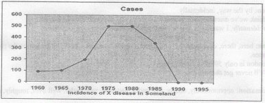
The single line graph illustrates the number of reported cases of a particular disease affected people between 1960 and 1995 in Someland. Primarily, the trouble was not prevented until 1980 where the figure started falling down.
The infection began to spread at 100 cases since 1960, and then it increased gradually by 80 types from 120 to 1965 to 200 in 1970. Between 1970 and 1975, the number rose significantly by 300 cases to 500, and the pattern stayed constant for the next five years. As mentioned above, the spread of X disease was controlled after 1980, where the graph dropped to number 350. Soon, the number of infections decreased much more, and finally the number of cases slumped to zero in 1990 and 1995. In the other words, the illness entirely eliminated among people.
In the final analysis, the single line graph represents that the outbreak of illness stopped after the turn of the 1980s.
Would you please revise my Academic Task 1 essay?
Note: I attached the graph.
The single line graph illustrates the number of reported cases of a particular disease affected people between 1960 and 1995 in Someland. Primarily, the trouble was not prevented until 1980 where the figure started falling down.
The infection began to spread at 100 cases since 1960, and then it increased gradually by 80 types from 120 to 1965 to 200 in 1970. Between 1970 and 1975, the number rose significantly by 300 cases to 500, and the pattern stayed constant for the next five years. As mentioned above, the spread of X disease was controlled after 1980, where the graph dropped to number 350. Soon, the number of infections decreased much more, and finally the number of cases slumped to zero in 1990 and 1995. In the other words, the illness entirely eliminated among people.
In the final analysis, the single line graph represents that the outbreak of illness stopped after the turn of the 1980s.