ielts-student
Member
- Joined
- Feb 15, 2016
- Member Type
- Student or Learner
- Native Language
- German
- Home Country
- Germany
- Current Location
- Germany
Hi, dear friends from UsingEnglish.
I am about to write my IELTS exam on Saturday and I would like to receive a last feedback regarding my essays.
Thank you in advance.
Kind Regards,
ielts-student.
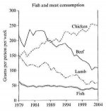
The graph below shows the consumption of fish and different kinds of meat in a European country between 1979 and 2004.
Summarise the information by selecting and reporting the main features and make comparisons where relevant.
Write at least 150 words.

The line chart depicts the consumption of distinct types of meat (beef, lamb, chicken) as well as fish in a European country in the period from 1979 to 2004.
Overall, the most remarkable trend is the negative correlation between beef and chicken, in addition to the linear growth of the first and the fall of the latter. The amount of lamb has declined steadily and no strong different can be found in the fish consumption along the period.
The quantity of beef used for nourishment in the researched country has reduced from 210 grams per week per person in 1979 to barely 100 gr/wk/person in 2004. On the other hand, the chicken consumption increased from 150gr/wk/person to impressive 250gr/wk/person in the same period, surpassing the amount of beef in 1989, when both indicators were about 200gr/wk/person.
Additionally, the population has drastically reduced the ingestion of lamb. The consumption of this kind of meat decreased from 150gr/wk/person to the modicum amount of 50gr/wk/person. This narrowed the gap between lamb and fish consumption, since the indicator for fish remained approximately unchanged.
I am about to write my IELTS exam on Saturday and I would like to receive a last feedback regarding my essays.
Thank you in advance.
Kind Regards,
ielts-student.
The graph below shows the consumption of fish and different kinds of meat in a European country between 1979 and 2004.
Summarise the information by selecting and reporting the main features and make comparisons where relevant.
Write at least 150 words.
The line chart depicts the consumption of distinct types of meat (beef, lamb, chicken) as well as fish in a European country in the period from 1979 to 2004.
Overall, the most remarkable trend is the negative correlation between beef and chicken, in addition to the linear growth of the first and the fall of the latter. The amount of lamb has declined steadily and no strong different can be found in the fish consumption along the period.
The quantity of beef used for nourishment in the researched country has reduced from 210 grams per week per person in 1979 to barely 100 gr/wk/person in 2004. On the other hand, the chicken consumption increased from 150gr/wk/person to impressive 250gr/wk/person in the same period, surpassing the amount of beef in 1989, when both indicators were about 200gr/wk/person.
Additionally, the population has drastically reduced the ingestion of lamb. The consumption of this kind of meat decreased from 150gr/wk/person to the modicum amount of 50gr/wk/person. This narrowed the gap between lamb and fish consumption, since the indicator for fish remained approximately unchanged.